Pay by Bank App
Built by Zapp, PBBA is the UK’s leading mobile payment innovator putting real-time payments on people’s mobile phones through their existing mobile banking app.
2015
UX, UI, Motion

Setting the framework
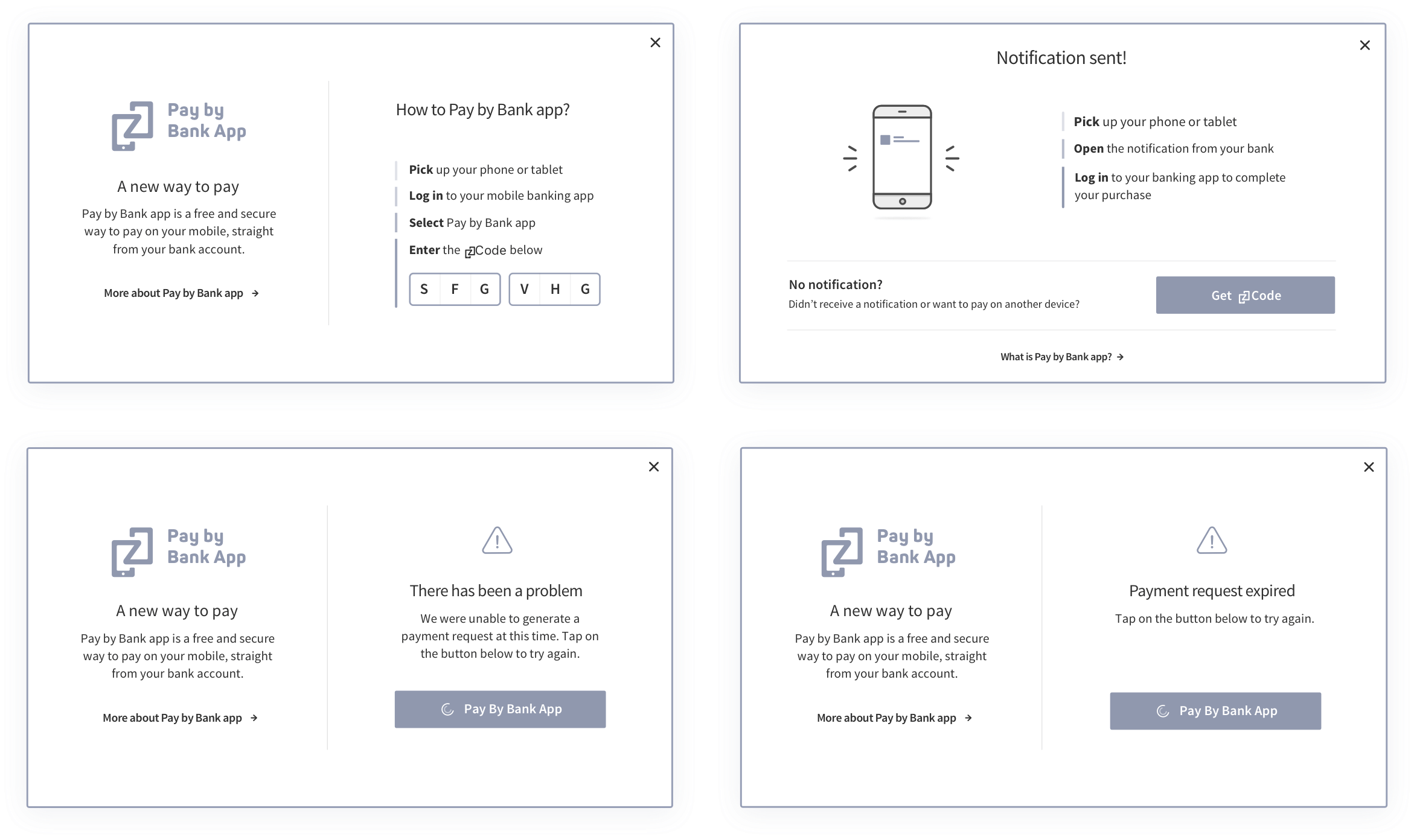
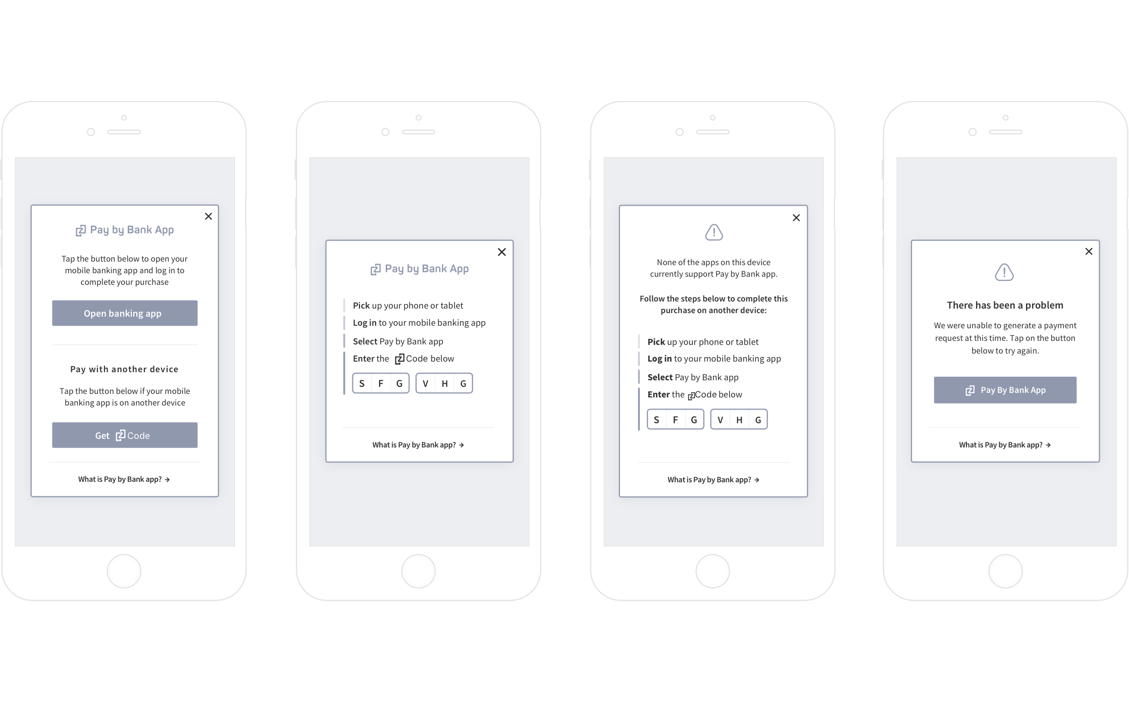
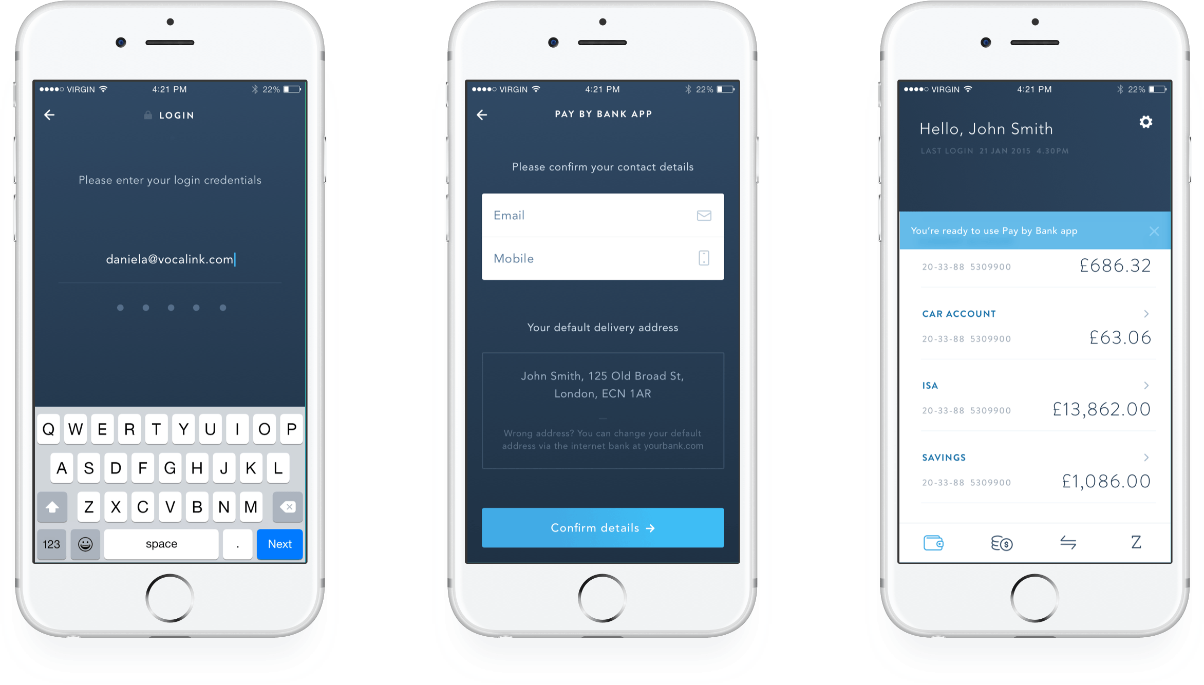
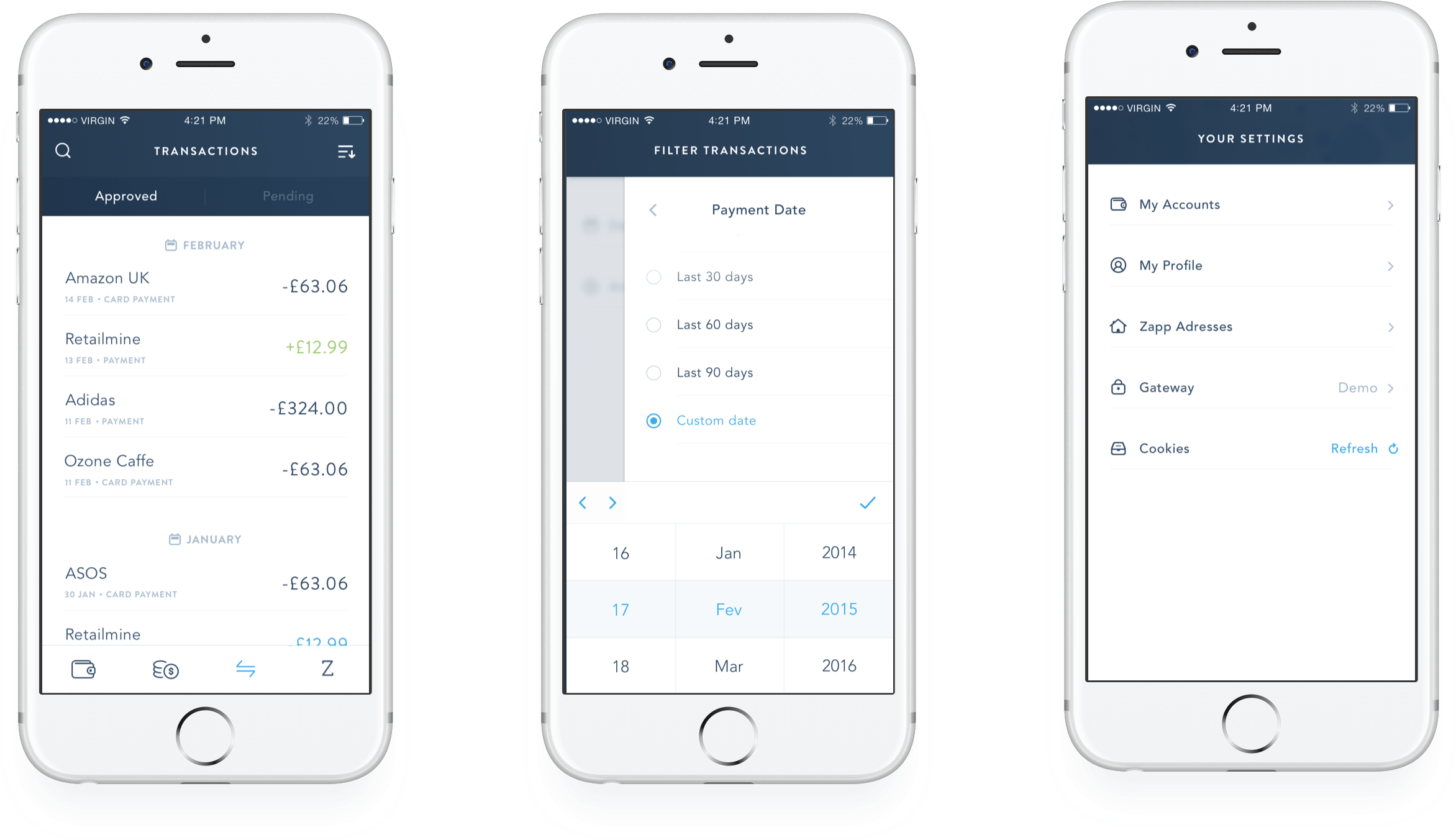
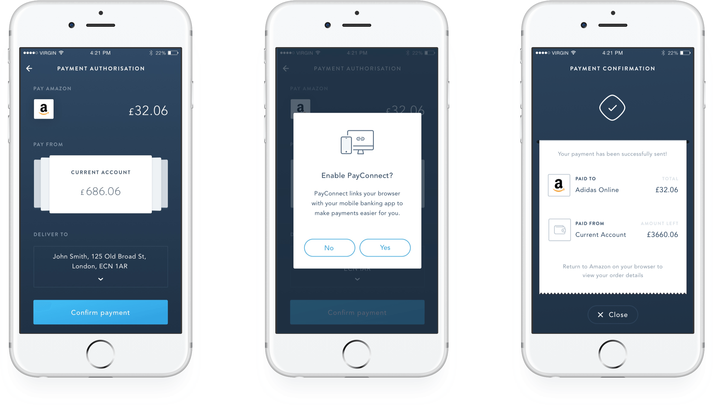
I have worked across 2 development workstreams. I helped to map out the flows and journeys which would be the consolidated into a UX guidelines document so that third parties (merchants, distributors, and CFIs) could integrate the framework in a consistent way. On another hand, I have also wireframed, prototyped and designed the banking mobile app which would be the first living place of PBBA's solution where all the user validation took place.
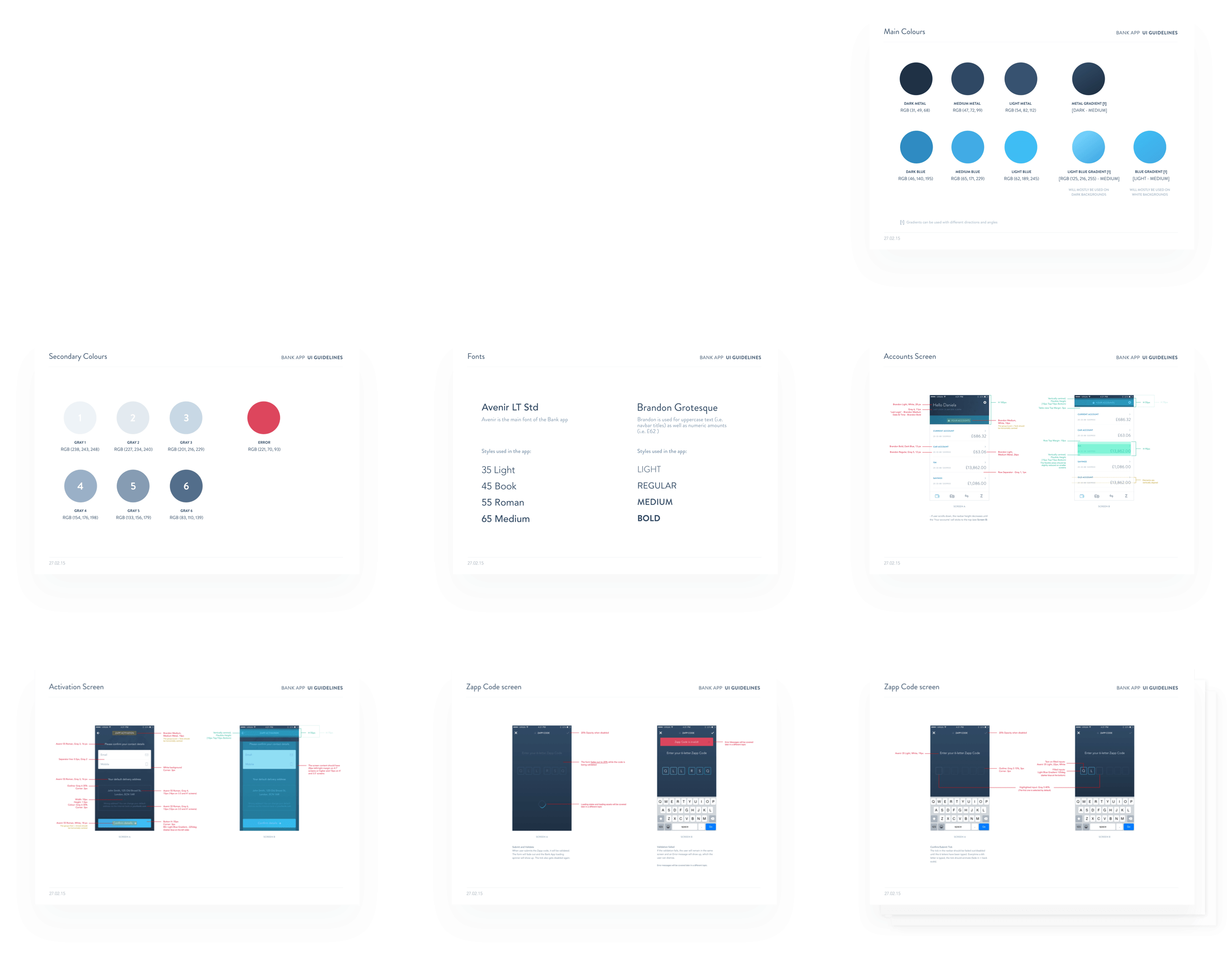
A neutral banking app
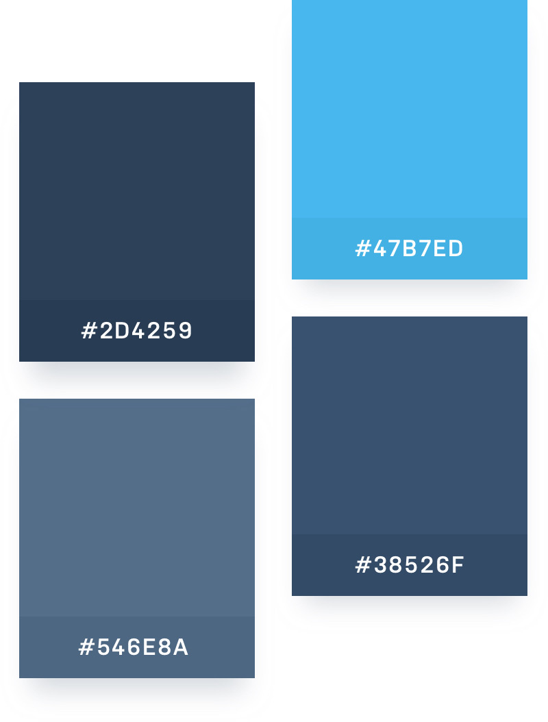
To design the mobile banking app, we had to take a neutral approach as by no means we wanted to compete with the major banks. Instead, we wanted to inspire them to take traditional banking to the next level. To achieve that, we analyzed the other banks' brand colours and came up with a unique but neutral, yet premium, colour palette.
Stunning clean visuals and motion were at the core of this app which was an innovative approach to what the landscape of mobile apps looked like at the time.
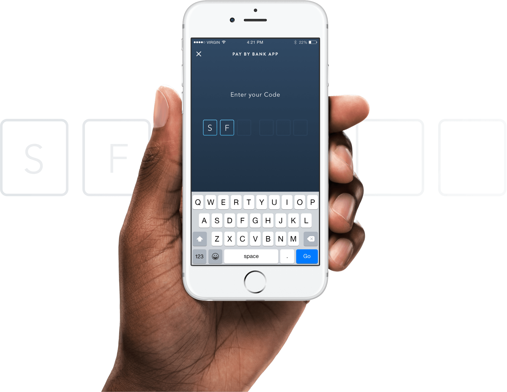


Designing for smart watch
We have also designed flows and visuals for a smartwatch version of our payments solution.
Developer's handover
We were building an enterprise solution which meant that detailed documentation had to be in place in order to ensure the integrity of the framework remained consistent as third parties started to build it into their existing applications.
Need help with design? / Great, let's talk
- @2018